Pollution in Ulaanbaatar
Every winter the skies of close up over Mongolia’s most populated city, Ulaanbaatar, and a cloak of pollution sits for months on end. It is here where year round pollution levels average 133 times the WHO recommended level. Most shockingly is that these conditions are typically only present in cities with 10s of millions of citizens in highly-dense urban environments, Ulaanbaatar has neither. In Ulaanbaatar: Choked by Pollution we explore the unique case of pollution through static and interactive data visualisation, completed for DECO3100: Information Visualisation studied during my Bachelor of Design Computing at the University of Sydney.
Problem
We were given the very broad brief of visualising one or more of the UN’s 2020 Asia Pacific Sustainable Growth indicators, the project required exploratory data analysis to find a topic area of our interest that was interesting and informative, had available or collectable data and highlighted an issue that western audiences may not be aware of.
We were drawn to Ulaanbaatar after discovering it was the most polluted capital in the world despite not fitting into our assumptions of what a polluted capital looks like. The promise of an insightful and interesting topic roughly lead use to our two Sustainable Development indicators.
11.6.2 Annual mean levels of fine particulate matter (e.g. PM2.5 and PM10) in cities (population weighted) 3.9.1 Mortality rate attributed to household and ambient air pollution
Data analysis
We began to research the issue by looking into articles and academic papers that covered the topic. What stood out to use was the way pollution spiked in the informal settlements, known as Ger districts, and was at its highest during the winter. We sourced the pollution history of 2017 from a number of monitoring stations around the city using AWS Athena to query OpenAQ’s database. Additionally, we gathered year round weather information to visualise the link between temperature and pollution.
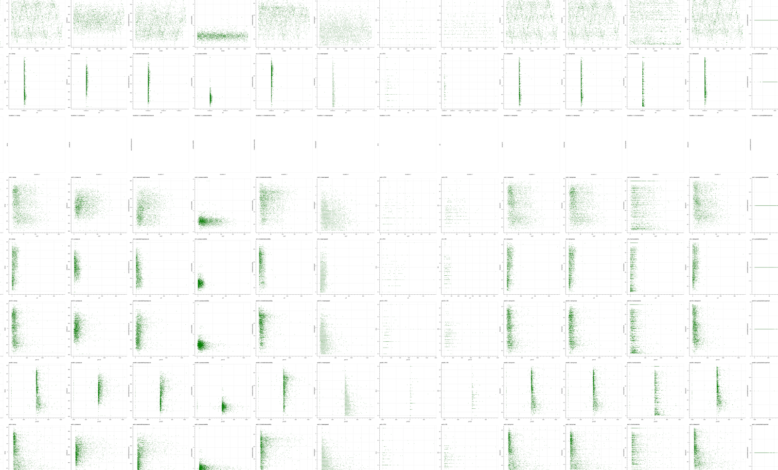
Project Data analysis
Exploring methods of static visualisation
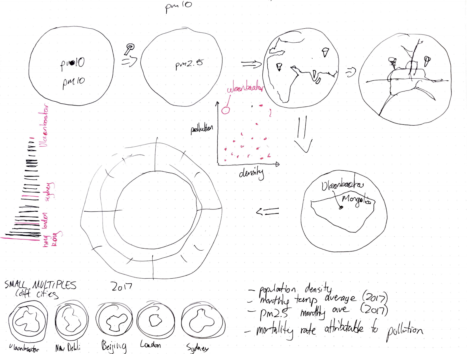
Sketch of data visualisation
With spatial, temporal, temperate and dimensions all correlating with different amounts of pollution we needed a way to show 4 dimensional data in a visually and thematically coherent way. We began to explore different methods of communicating the message, starting with scatter plots However, we found these to be visually unexciting and wanted to repurpose some of these ideas to create a more thematically fitting visualisation.
Static visualisation
The second assessment was to develop a single A4 static visualisation which communicating the main points of our thesis.
We wanted to emphasize the cyclical nature of pollution in Ulaanbaatar by using a radial chart highlighting the averaged pollution levels for each month. To visualise the spatial aspect by color coding each pollution station’s point on a map and associating it with its own line running around the bar chart. This was superimposed over a map of the city that was categorised into ger and non ger districts.
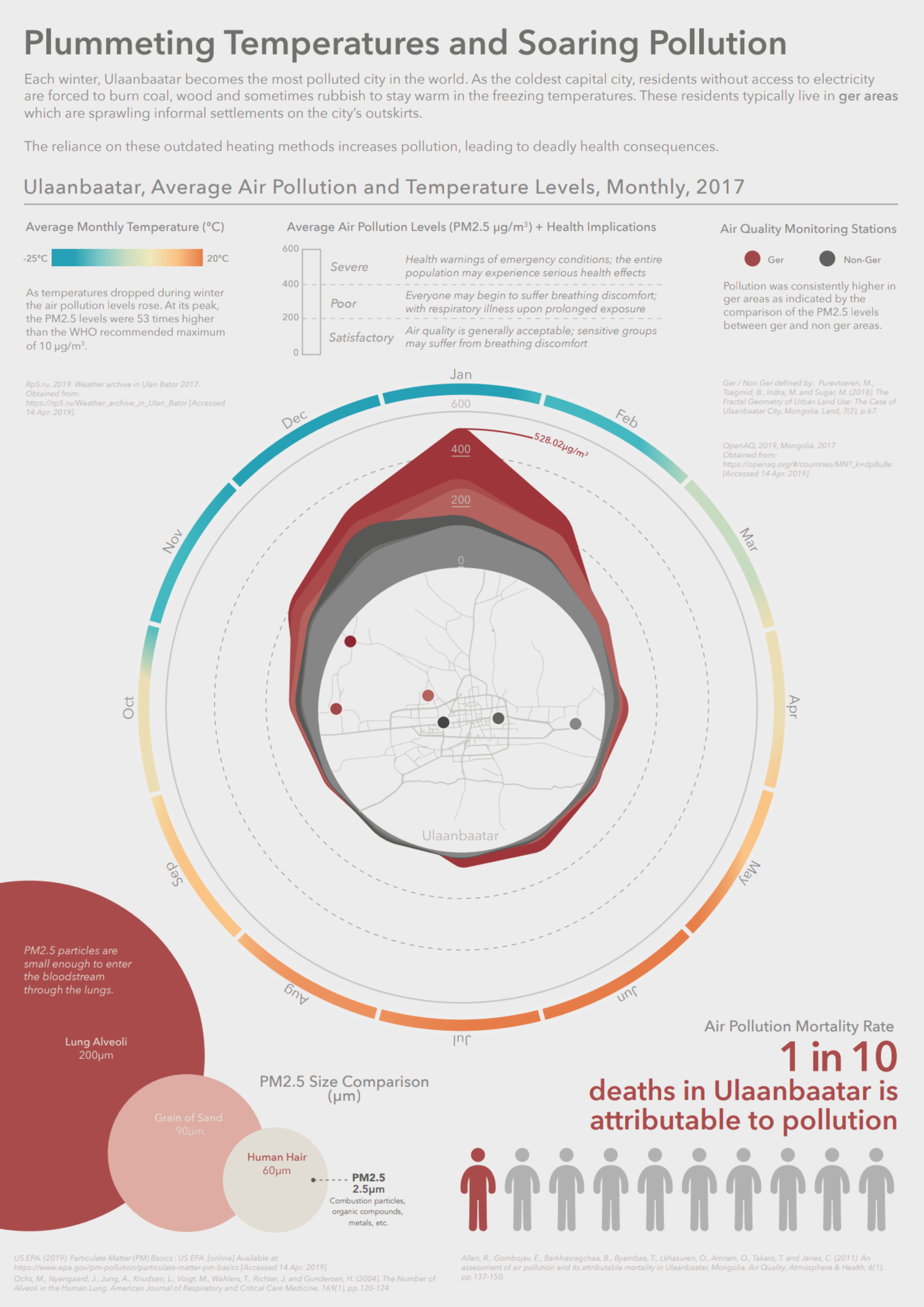
Poster containing information on the dynamics of pollution within Ulaanbaatar
Final Project

First sketch of final concept of static visualisation
For the interactive visualisation we took visualising the spatial element of pollution to another level by letting users experience where it occurs in a 3D landscape with the ability to click on each pollution monitoring station and view a high resolution image of the surrounding urban landscapes. Doing so highlights to the user the differences in living conditions and the hidden side-effects of multi-dimensional poverty. Additionally we extended the temporal and cyclical themes of the pollution by building a radial graph on the right hand side of the screen that progressively shows more information as the user scrolls.
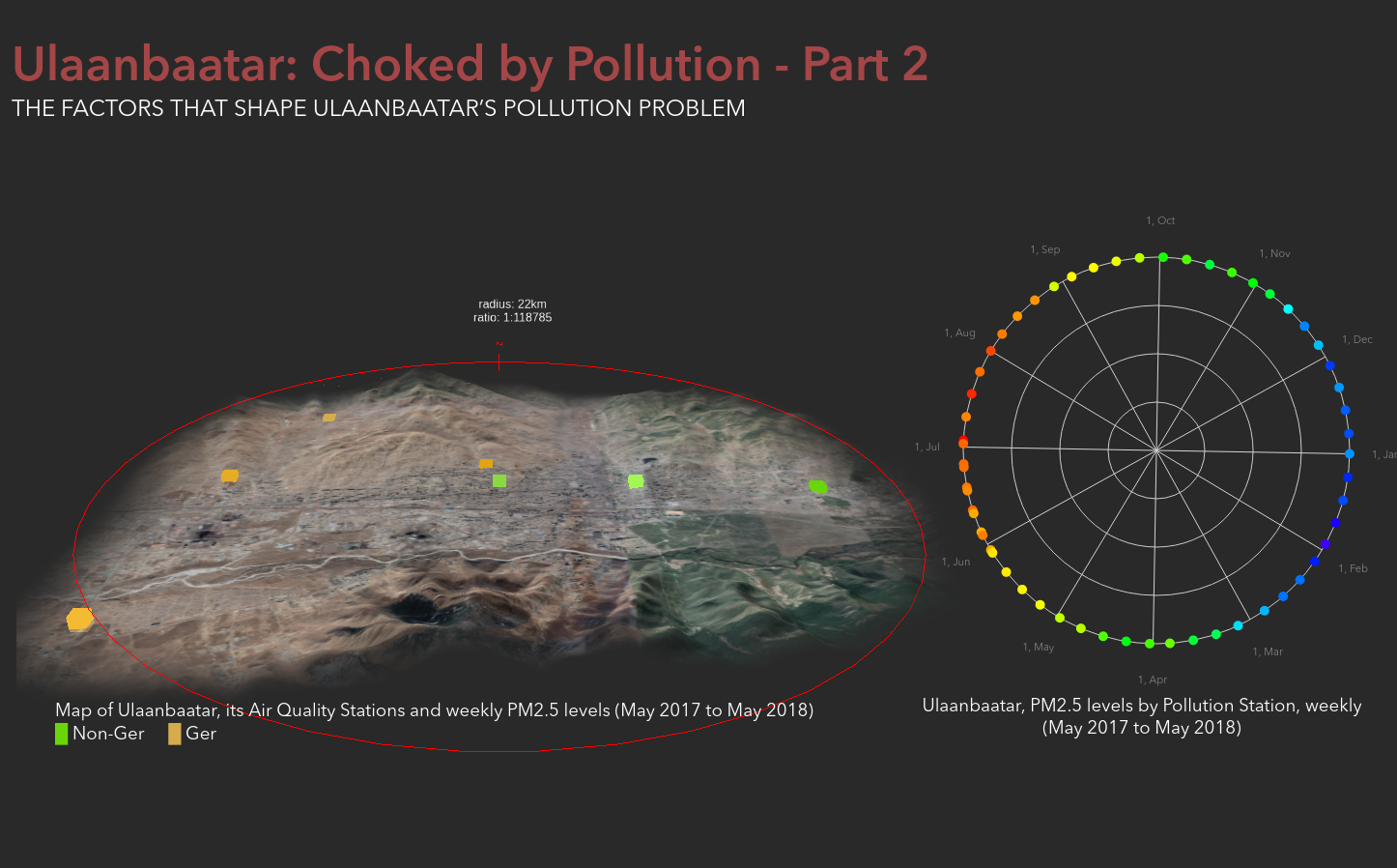
Image of final submitted assessment, featuring 3D map of Ulaanbaatar and a radial graph highlighting pollution and temperatures simlar to our static visualisation
Redesign
After submitting the project I was unhappy with the design and interaction of the experience and continued to refine it. Having two graphs updating onscreen at the same time split the users focus and didn’t clearly communicate the massive spike in pollution during the winter. I opted to remove the radial graph and instead convert the 3D map into a bar chart at the end of the visualisation letting the user recap what they had just witnessed over the year. We also switched the colour scheme to update the background based on the temperature of the weather at a given point in time.