Sea of Tweets
Sea of Tweets was an interactive data visualisation on the 2016 presidential election comparing the Democratic and Republican primary candidates real-world and twitter presence. It made use of the Huffington Post pollster and Twitter APIs to get tweets and the sentiment towards each candidate. This was the project that started my journey and interest in creative coding.
Showcase

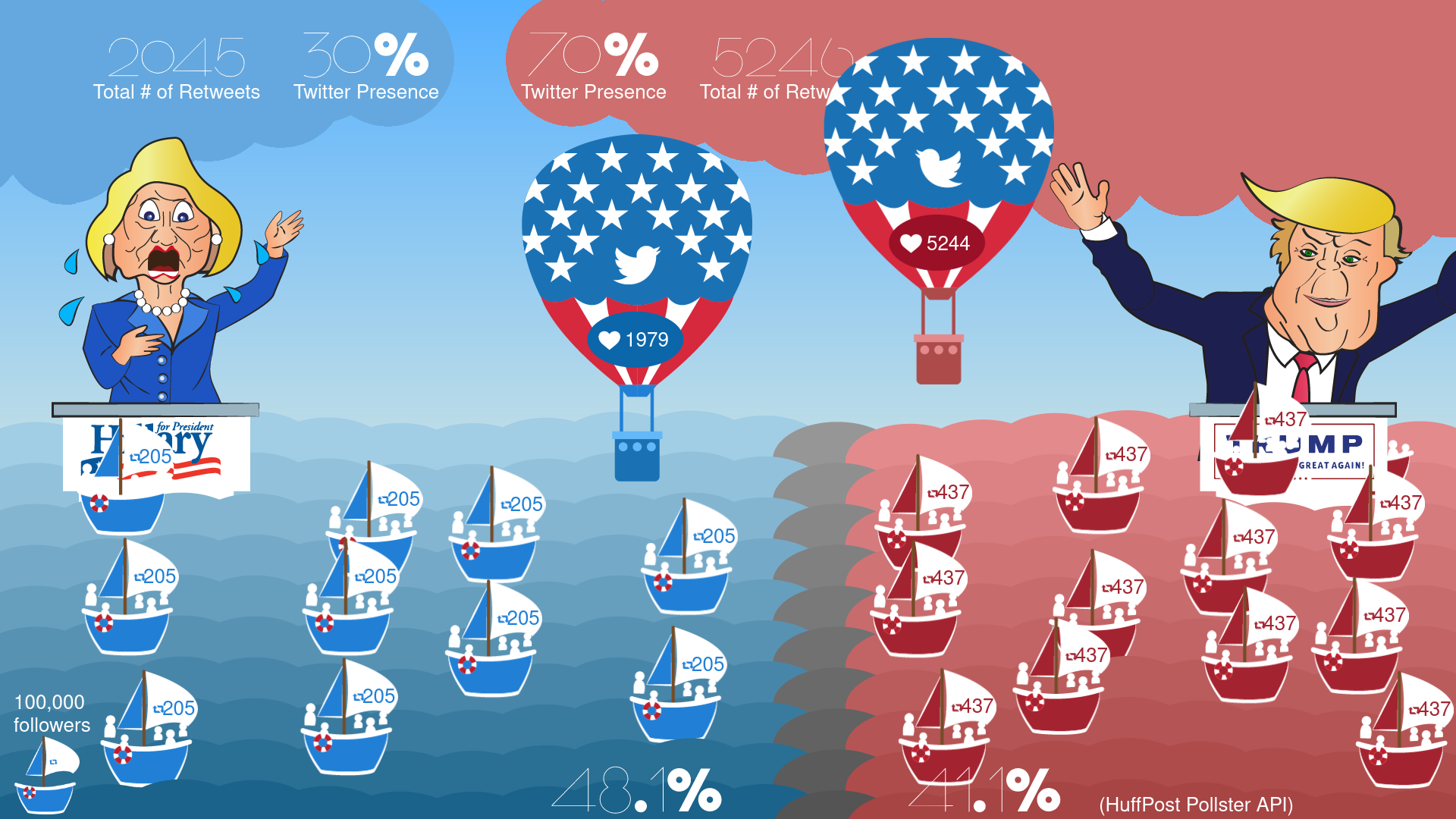
Image of final assessment showing cartoon renditions of Donald Trump and Hillary Clinton.
Explanation

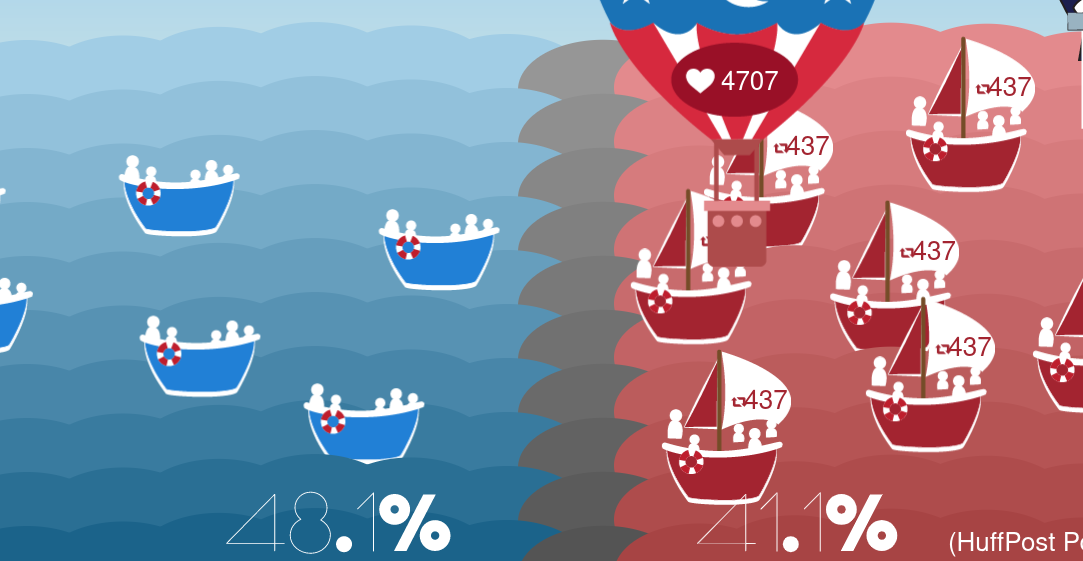
Image of final assessment showing cartoon renditions of Donald Trump and Hillary Clinton.
The sea is a bar chart visualising sentiment towards each candidate, including the ~5% undecided at the time the results were recorded and each boat represents 100,000 followers.

Image of final assessment showing cartoon renditions of Donald Trump and Hillary Clinton.
The sky represents the twitter presence, accumulates the total number of likes on each tweet and compares it between the candidates.

Image of final assessment showing cartoon renditions of Donald Trump and Hillary Clinton.
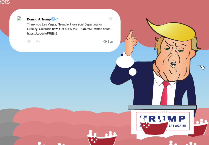
Each candidate takes turns saying a tweet, these were queried each hour from the twitter API, however to preserve the functioning of this demo, this currently runs of a cached response from 2017.

Image of final assessment showing cartoon renditions of Donald Trump and Hillary Clinton.
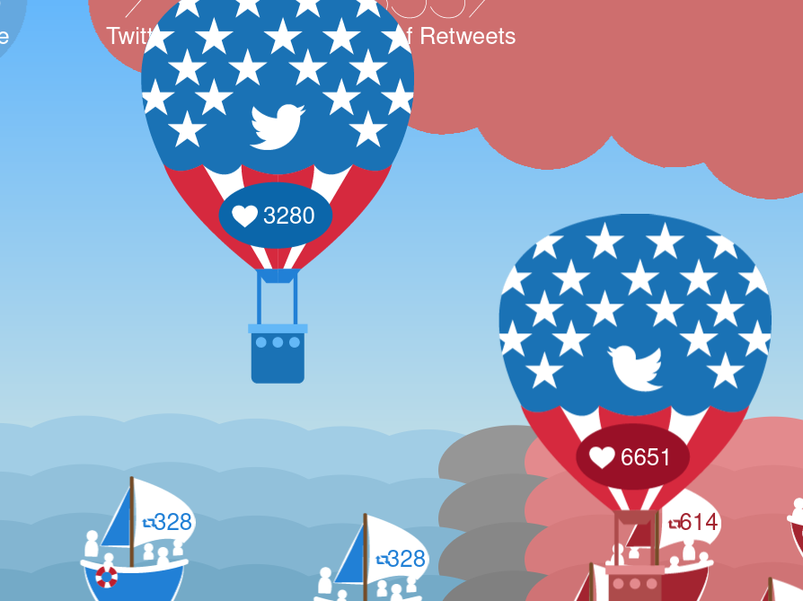
The amount of likes in each tweet is counted in a balloon, one candidate will win and cheer, the other will burst into tears and their balloon will deflate.